How to Reduce Cognitive Load in UX/UI Design: Expert Guide

In today’s digital landscape, users constantly interact with different interfaces, process information, and make decisions. These constant interactions put a mental load on users, and when that demand becomes too high, it leads to cognitive overload, resulting in poor user experience and frustration.
As UX designers, it’s our responsibility to reduce this overload and design intuitive, user-friendly designs. A user-friendly design not only reduces cognitive overload but also helps retain visitors. This blog explores different strategies that can help minimise cognitive load using effective UX design, drawing on established psychological principles and best practices.
What Is Cognitive Load in UX/UI?
When a user engages with the interface of a website, they are constantly processing what they see on the screen. This includes the colour scheme, the layout of content, the graphics, and the navigation menus.
In most cases, the human brain processes all this information effortlessly. However, when the user is bombarded with too much information or performs several tasks simultaneously, their working memory can get overwhelmed, causing cognitive overload.
According to cognitive load theory, the human brain can process only a certain amount of information at a time. If this limit is crossed, the user might suffer from mental fatigue, confusion, or errors, which can affect the user experience negatively. This is an important concept to understand for designing an interface that is intuitive and not overwhelming.
Key Takeaways
- Cognitive load refers to the mental effort required to understand and interact with an interface, not just its visual appearance.
- When users are presented with too much information at once, their working memory can become overloaded, leading to confusion and errors.
- Reducing friction and simplifying interactions helps users stay focused on their task rather than figuring out how the interface works.
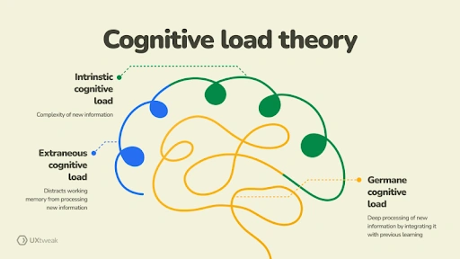
Types of Cognitive Load
There are three main types of cognitive loads:
1.Intrinsic Load: This happens where there is an inherent difficulty in performing a task or interacting with content.
2.Extraneous Load: Poorly designed UX can create unnecessary complications for the users, causing extraneous load.
3.Germane Load: Germane cognitive load refers to the mental effort needed to process or understand content.
The goal of a UX designer is to manage these loads effectively and ensure a seamless user experience.
Cognitive overload affects both the user’s immediate experience and their long-term relationship with a brand or product. If a user consistently feels overwhelmed due to complex interfaces, it can lead to a higher dropout rate, lower engagement, and ultimately poor user retention.
Studies suggest that when a user struggles to navigate an interface or complete a task, they are more likely to abandon the website and look for an alternative. Besides this, cognitive overload can also cause:
- Increased task errors that frustrate the users, creating the perception that the product is difficult to use or unreliable.
- Loss of trust in the product or the brand altogether, as consistent frustration will prevent them from returning to the brand or recommending it to others.
- Website abandonments at key conversion points, such as online checkouts or form submissions. This can directly affect business metrics such as sign-ups or sales.
All these factors further emphasise the need for minimising cognitive overload on the visitors. It is not only about the visual aspect of the design but also about the mental effort that is required to engage with and navigate a platform. Too much information at once is overwhelming for the working memory of the visitors and results in abandonment of the site.
Let’s take a look at different ways you can ensure minimal friction for the users and keep them focused on their task rather than deciphering the interface.

Simplify Layouts with Visual Hierarchy
One of the main reasons for cognitive overload in visitors is complex and cluttered interfaces that make it harder for users to decide what to focus on first. Eliminating unnecessary elements and simplifying the design can help reduce mental strain significantly. This phenomenon is known as decision fatigue, and this is where Hick’s Law comes into action.
According to Hicks’s Law, the time it takes to make a decision increases if there are too many choices and all of them are complex. Take a food ordering app as an example. If, in this app, hundreds of restaurants were listed without any particular order or option to filter them, the user will immediately feel overwhelmed and quit the app.
Best Practices:
Here are a few ways to simplify layouts and visual hierarchy to reduce site abandonment:
- Prioritise Visual Hierarchy: All UX/UI elements should be arranged properly so they naturally guide the user’s attention from one element to the next. You can even use different sizes, colours, and contrasts to highlight important features while creating a logical flow of information. However, it’s important to stick to a theme as random font types, sizes, or colours will again confuse the viewer.
- Minimise Visual Clutter: One of the reasons people prefer a minimalistic design is that it removes all distractions. This type of design avoids elements overcrowding and provides ample space for content to breathe.
- Consistent Design Language: As mentioned earlier, it’s vital to have consistent design elements such as typography, colour schemes, and iconography. Having consistency in your branding makes it easier for users to recognise patterns and reduce the cognitive load when learning a new interface.
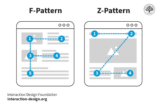
When designing a UI/UX, many designers follow either a F-pattern or a Z-pattern approach. These two patterns describe how users naturally scan or read content on a screen. You might have noticed the F-pattern more on text-heavy pages like newspapers, where users read across the top, scan a second horizontal line, and move down the left side.
On the other hand, the Z-pattern applies to simpler layouts like landing pages, where the eye moves from top left to top right, diagonally down, and across the bottom. These layout patterns help reduce cognitive load by placing important information where users expect to find it.
Apart from simplifying and using predictable layouts, it’s also necessary to remove clutter from the website and present important information clearly.
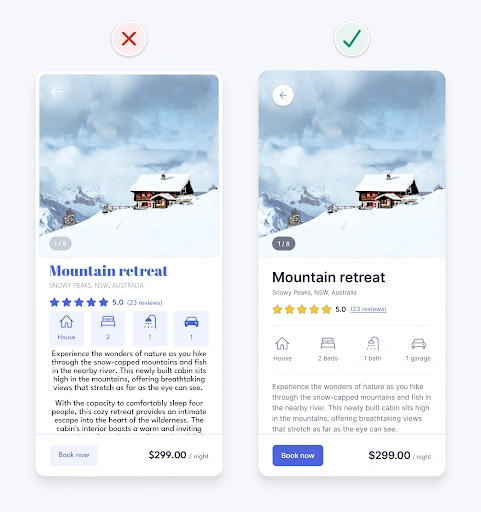
Prioritise Information, Remove Clutter
Another key factor in reducing cognitive load is keeping interfaces clutter-free and prioritising essential information. Text-heavy interfaces can easily overwhelm users, especially if the content is poorly formatted or dense. By removing clutter and improving readability, you can ensure that visitors on your website can easily and quickly comprehend the information presented.
How to Reduce Clutter:
These are various ways to reduce clutter on your website, such as:
- Optimise Typography: Especially when optimising for mobile devices, it’s important to choose legible fonts and appropriate font sizes. Break up large blocks of text into smaller groups and add sufficient line spacing so there’s breathing space for the reader to pause and reflect on what they just read.
- Leverage Microcopy: Microcopy can be a great tool to guide users through different tasks. Using concise, informative text can reduce cognitive load by eliminating ambiguity.
- Ensure Accessibility: When designing a UI/UX, focus on inclusivity by adhering to the accessibility standards. These standards also include the use of high-contrast colours and alt text for images, and ensuring interactive elements are easily navigable using a keyboard.
Too many elements on the screen can force users to filter out noise, which ultimately increases extraneous cognitive load. Instead, prioritise essential content and hide advanced options for viewers to check on their own when needed.
Reducing the number of elements can help, but it’s also important to use familiar patterns when arranging these elements and ensure consistency across all webpages.
Leverage Familiar Patterns & Consistency
When users recognise familiar UI patterns, they rely less on memory and can interact naturally with your product. Consistent components and predictable behaviours reduce confusion and cognitive overload.
The same principle also applies to the navigation system, as a well-organised navigation system can significantly reduce pressure on the viewer. They should be able to find what they’re searching for without exerting too much mental energy.
This familiar pattern should also be consistent throughout the website. Imagine having to find an “add to cart” button on every product page as it moves to a different corner of the screen on every page. It is not only frustrating and triggers cognitive overload, but it is also a common cause of cart abandonment.
Consistency Tips
Consistency is about more than how the website looks. It’s about building trust. Here are a few things you can try:
- Start by using standard navigation menus, such as a hamburger menu or a bottom navigation bar.
- Keep button styles and familiar icons uniform across all webpages.
- Standardise language for labels, headings, button text, etc, on all pages.
These minor changes, when incorporated correctly, can significantly reduce the cognitive load on a user

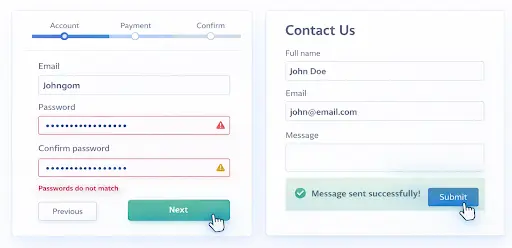
Provide Clear Feedback & Interaction Cues
Offering clear feedback helps users understand what happens when they take an action. This reduces uncertainty and mental effort because the interface is responding predictably, making users feel more confident in their actions.
Interaction Cues to Include
These interaction cues improve the user experience by reducing the mental effort required to understand the UI/UX design.
Visual Feedback on Interaction
Visual feedback refers to how a button or menu reacts when a user interacts with it. For example, when you type on an iPhone’s keyboard, the key hovers on top, suggesting you’ve pressed that particular key. Similarly, in UI/UX, this visual feedback is integrated into buttons and interactive elements, so when a user hovers, taps, or clicks them, they behave differently. This confirms that the element is interactive and that the action has been registered.
System Status and Outcome Messages
Interfaces should clearly show success, errors, or the next step after an action. For example, clicking on the “add to cart” button should prompt a message like “added to cart” to reassure users. Similarly, having error messages helps users understand what went wrong.
Progress Indicators
In forms or multi-step tasks, having progress indicators helps users by showing them where they are in the process and how much remains. This reduces uncertainty and makes longer tasks feel manageable.
Final Thoughts
Designing for clarity does not mean removing personality from an interface. It means presenting information and interactions in a way that respects users’ attention and mental limits. By reducing cognitive load through clear structure, familiar patterns, and timely feedback, designers create experiences that feel easier and more reliable to use.
Over time, this leads to higher engagement, fewer errors, and stronger user satisfaction. Working with UX and UI design experts like Designpluz can help ensure these principles are applied consistently across digital products.


