How To Choose The Right Typeface For Your Website

Typography is an important factor that affects how users interact with digital products, and it has a significant influence on how they are able to process and navigate them. In cases where typography is considered an afterthought, it usually results in messy designs, as well as an increase in user confusion and complexity.
According to a study by the Readability Consortium, readers can process information up to 35% faster when text is presented in the right typeface. Additionally, 38% of users have stopped engaging with websites that have poor layouts or unappealing designs. As a result, choosing the right fonts plays a crucial role in improving user retention.
This blog explains what a typeface means in UI and web design and outlines how to select one that supports usability, performance, and conversion goals.
What is a Typeface in UI and Web Design?
A typeface is the overall design of letters, numbers, and symbols that define the visual voice of your text. In UI design, the right typeface improves readability and enhances the user journey across your website or software product.
The design of a typeface determines the way the characters are constructed, arranged and proportionate. The creation of this design ultimately impacts how easily the user recognises the characters and scans the content.
For example, banking websites generally use clean and professional typography with consistent stroke widths and restrained proportions to provide a sense of trustworthiness. On the other hand, children’s educational applications commonly use rounded letterforms with softer terminals and greater space between words to minimise visual stress and create a more approachable feeling for younger users.
The right typeface:
- Determines the personality of the interface: Typeface selection significantly influences how users interpret the brand identity and credibility. The arrangement of letterforms, stroke structure and proportions determines whether the user perceives an interface as efficient, contemporary, authoritative or traditional.
- Affects readability and user comfort: Parameters like x-height, stroke contrast, counter openness, and letter spacing directly influence the speed of reading and the visual comfort of users. Incorrect typeface selections will decrease reading speed and cause eye fatigue, particularly when there is excessive content.
- Affects accessibility and the ability to scan pages: Typeface rendering changes depending on the display screen size and resolution. When typefaces lose clarity at small sizes or fail to distinguish between similar characters, the accessibility of an interface is negatively impacted, particularly for visually impaired users and mobile-first interfaces.
Exploring the Main Types of Typefaces
Different typefaces work differently for digital environments, so choosing the right style creates clarity and hierarchy. Websites typically use clean, legible fonts for body text and expressive fonts for headings.
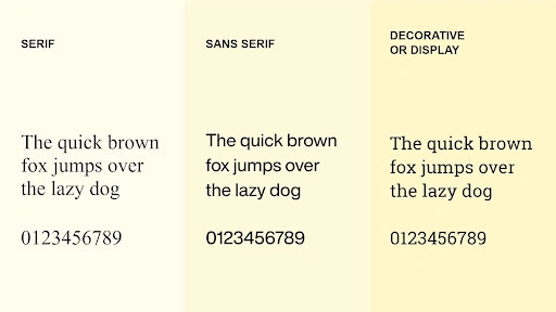
Serif
Serif typefaces contain small decorative strokes called serifs at the end of letterforms. Serifs aid the user in scanning left-to-right along lines of text, which can assist users who will be reading long pieces of text. Many modern serif fonts have been optimised for digital use, featuring adjustments in spacing and stroke contrast to keep the text clear on digital displays.
Serif fonts are particularly useful in editorial sites, publishing platforms, and in all instances where continuous reading is a main user action.
Sans-serif
Sans-serif typefaces do not possess decorative strokes, creating cleaner letterforms with more uniform stroke widths. Sans-serif typefaces maintain clarity at various sizes and weights due to their structural simplicity, making them ideal for digital interfaces.
Sans-serif fonts are versatile and can be used for both headings and body text. They also scale well across devices regardless of screen size. Examples include Helvetica, Arial and Roboto.
Decorative
Decorative typefaces are stylised fonts with distinct personalities. They are designed to attract attention rather than support extended reading and are therefore used sparingly for highlights or micro-moments within an interface.
These styles work well for logos, hero sections, and special announcements, but are not suitable for body text. For instance, a handwritten script typeface may enhance the branding of a wedding photography website but would reduce usability if applied to navigation menus or product descriptions.
Practical Tips for Choosing Fonts for a Better Website
Once you know what a typeface is and the different types available, the next step is to choose fonts wisely.
1. Begin with UI Inspiration
Before selecting fonts, explore real website interfaces to understand what feels modern, readable, and user-friendly. Studying existing patterns helps you set a visual direction for your own design.
Here’s how you can do it:
- Browse UI galleries like Dribbble, Mobbin, and Awwwards:
These platforms show you the current design trends. Look at how designers use font combinations in navigation menus, hero sections, and card designs. See which fonts are used in mobile-first apps versus desktop-centric apps. - Identify trends in headings vs body text:
Typically, headings are displayed with more distinctive typefaces that are either geometric, condensed, or bold; whereas body text uses neutral, highly legible typefaces. The contrast established between these elements aids users in identifying content types and improves the scannability of the layout. - Note examples that feel clean and highly readable:
Capture interfaces that encourage prolonged reading, and analyse the use of line height, paragraph spacing and font weight throughout elements such as buttons, links and body text. Often, the micro-typographic decisions made here contribute more to the legibility of the text than the selected typeface itself.
2. Choosing Your Primary UI Font
Your primary font shapes both the tone and usability of your interface, especially in body text and navigation. Choose a typeface that remains clear at small sizes across devices, and remember that while custom fonts offer uniqueness, they require a purchased license. Google Fonts can be a performance-friendly alternative.
When evaluating options, make sure to:
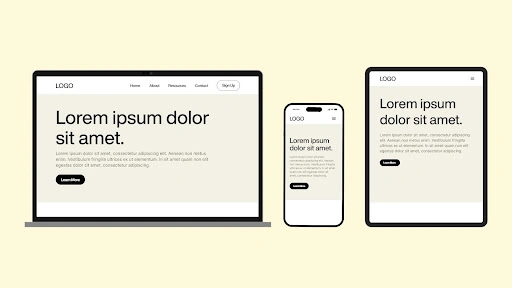
- Prioritise legibility at multiple resolutions:
Users expect to clearly see characters and sufficient spacing, regardless of screen size. Larger x-heights (the distance from the top of a lowercase ‘a’ to the baseline) are beneficial for maintaining character clarity at smaller sizes. - Consider Google and system fonts for performance:
System fonts like San Francisco (Apple) or Segoe UI (Windows) load instantly. It is because they are already on users’ devices. Custom web fonts might be unique, but they increase page load time. In fact, Google found that 53% of mobile users abandon sites that take over three seconds to load. - Check how characters render on mobile:
Do not simply review your fonts on your desktop. Create sample pages on your mobile devices. Although some typefaces appear sharp on high-resolution displays, they can appear distorted on lower-quality screens. Spacing that appears sufficient for desktop viewing may not appear sufficient for mobile viewing.
3. Creating Contrast with Secondary Fonts
A secondary typeface helps create hierarchy, guiding users through titles, buttons, or key sections. Pairing contrasting fonts keeps layouts visually interesting without sacrificing clarity. The goal is to induce visual interest among users without chaos.
Some effective pairing strategies:
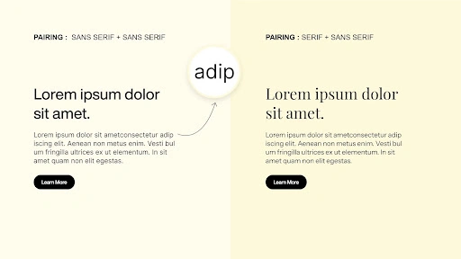
- Try pairing serif + sans-serif for balance
This classic combination works because the contrast is built in. A modern sans-serif for body text paired with an elegant serif for headings feels both contemporary and sophisticated. Alternatively, flop it with serif body text with bold sans-serif heading, if you are designing editorial sites. - Vary stroke width, spacing, or shape:
If you’re using two sans-serifs, make sure they differ in style and font. For instance, pair a condensed, geometric sans-serif heading with a rounded, open sans-serif body to create contrast and establish a clear hierarchy. Fonts that are too similar will confuse the users. - Ensure the pairing works in both light and dark mode:
82% of users prefer dark mode for evening browsing. This means that you have to match the font to ensure that the text is readable on both light and dark themes. You have to test your design decisions against dark backgrounds. Some fonts may look good with a white theme but poor with a dark theme.
4. Keeping Your UI Typeface Selection Simple
It is important to limit your design to 2-3 typefaces. This is because a simple design is crucial for maintaining a consistent look and feel while ensuring user ease of use for web interfaces. A simple design also enhances speed and a clean look.
Sticking to a simple typography:
- Helps maintain design discipline:
Restricting typeface usage enforces consistent use of typographic variables such as size, weight, spacing, and colour to establish hierarchy. This approach strengthens the underlying design system, improves scalability, and ensures visual consistency as the product evolves. - Improves page performance:
Each font file adds to your page weight. Google recommends keeping the total page size under 1MB for optimal mobile performance. Limiting the number of typefaces reduces font file payloads, freeing up network bandwidth for images, video assets, and interactive elements that contribute more directly to user engagement. - Creates a cohesive, professional UI:
Consistent typography signals structural coherence and design intent, which users associate with professionalism and reliability. A restrained, well-defined typography system builds trust and supports user actions such as sign-ups, form completion, and conversions.
The Takeaway: Typography Shapes Interface Performance
A well-structured typography system ensures readability, hierarchy, and usability across digital interfaces. Effective typeface choices reduce cognitive load and maintain consistency across devices. A UI/UX design partner like Designpluz can evaluate existing typography systems and identify gaps. These optimisations improve accessibility, performance, and conversion outcomes.


